The internet is an interesting place. As we all know so very well by now it can be absolutely terrible. Hell, let’s be honest, it can be a steaming pile of shit that follows you around repeatedly trying to slide into your DMs with all-caps messages and the grammar-equivalent of stink lines.
There are, of course, beautiful moments of kindness, compassion, and charity that go a long way to offset the bad — but then there are also the strange moments that border on stupefying.
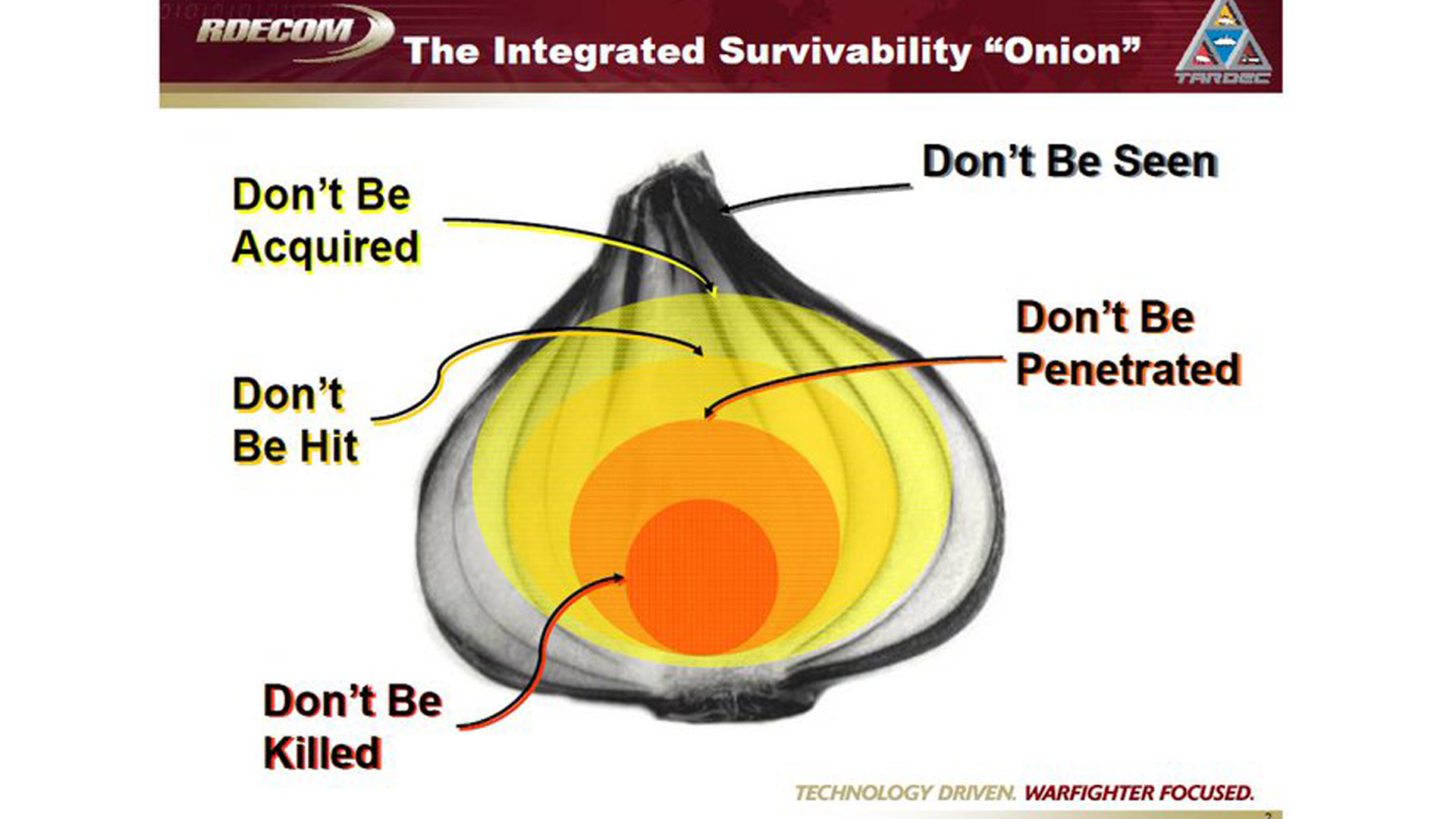
It’s with that in mind that I introduce the “Integrated Survivability Onion” PowerPoint slide which seamlessly combines the “wtf did I just see” elements of the internet with the military’s ability to transform anything — even something as gripping as “don’t be killed” — into a mind-numbing pixelated JPEG.
Posted to the DefenseCharts Twitter account, the slide appears to be part of a Department of Defense presentation. The chart is actually so silly-looking that someone created a KnowYourMeme entry for it under the category: Science Diagrams That Look Like Shitposts. After a little bit of Google-fu, it seems like the “survivability onion” principle is often used in discussions and classes on armored and naval warfare and lays out the various steps between “hey, I see a bad guy” and “oh, shit, he sees me” to “holy crap, they’re shooting,” as well as what you should be doing at each point along the way.
RELATED: This military graphic on electronic warfare should give everyone nightmares

Now, most of us on the Task & Purpose staff aren’t familiar with this chart — speaking personally, my death-by-PowerPoint experiences were along the lines of that infamous counter-insurgency operations slide that looks like an M.C. Escher illustration. So, we wanted to turn to you, our readers to ask: Are you familiar with the Integrated Survivability Onion? Have you seen this slide? Does it make sense? If so, please explain what the hell it means to us, and how this principle is applied in real life.
We’re serious, we want to know. Reply with your comments and we’ll round them up and do an explainer post on the Integrated Survivability Onion. And, if you see any other confusing, or hilarious DoD charts out there, send them my way at James@taskandpurpose.com, and I’ll see about writing those up, too.