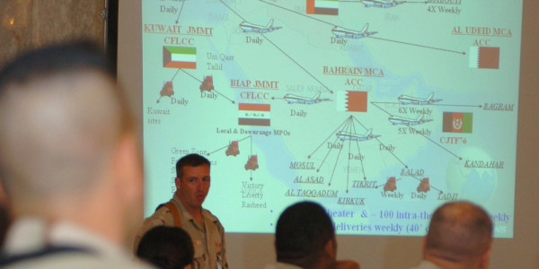

Recently, Secretary of Defense Ashton Carter reportedly banned PowerPoint slides from a crucial meeting with his military advisors in the Middle East.
He’s not the first to do so, either. Lt. Gen. H.R. McMaster, one of the Army’s most brilliant minds, also made the software verboten when he commanded a cavalry regiment in Iraq.
Yes, PowerPoint. It’s been raked over the coals on the front page of the New York Times and skewered by late-night comedians. In Switzerland, a political party known as the Anti-PowerPoint Party blames the software for over two-billion francs’ worth of economic damage per year. A Microsoft employee, echoing the exasperation Robert Oppenheimer must have felt after developing the atomic bomb, once confided in me, “It breaks my heart to see what the military’s done with our product.”
But perhaps the most damning indictment comes from former Secretary of Defense Robert Gates, who, in his memoir, described a meeting with Iraqi Army officers: “And right there in the middle of a war zone…I got a PowerPoint briefing by Iraqi officers. PowerPoint! My God, what are we doing to these people?”
And while it’s painful enough to sit through PowerPoint briefings, making them is even worse — just ask the military’s legion of PowerPoint Rangers.
But it doesn’t have to be this bad. Just take a look at these five ways you can make PowerPoint less painful in your organization.
1. Keep it simple.
So there I was, the day battle captain, furiously pasting slides together for the nightly commander’s update briefing during Hurricane Katrina. All of a sudden, I saw this gem of a slide:
A “Pattern Analysis” slide for New Orleans, September 2005.

The room was silent as my battalion commander leaned forward, brow furrowed in thought. After an agonizing minute, a staff officer shattered the silence.
“Sir, we believe that most violent crime in New Orleans occurs on Friday and Saturday night.”
In other breaking news, debauchery in New Orleans tends to increase around Mardi Gras, in the area of operations surrounding Bourbon Street, with a positive correlation between the amount of moral depravity and glass beads.
All kidding aside, not only was this offender difficult to comprehend, it was probably sheer agony to build as well. PowerPoint’s low resolution makes it a poor tool for complex data sets (more on that later). When it comes to PowerPoint, it’s best to stick to simple bullets and pictures.
2. Start from scratch.
“The first, the supreme, the most far-reaching act of judgment a PowerPoint Ranger can make is to establish the type of PowerPoint briefing on which they are embarking—neither mistaking it for, nor trying to haphazardly copy-and-paste it into, something that is alien to its nature,” said Carl von Clausewitz. I swear.
It’s time to brief the commander on that big project. What do you do?
If you’re like many PowerPoint Rangers, you rummage through the shared drive, find a few good-looking PowerPoint slides, change a few words around, and voila, you’ve got a PowerPoint slide show.
Right?
The “no original staff work” mentality is bad for several reasons. Let’s start with the obvious — staff officers who are too lazy to make their own slides are usually too lazy to copy and paste slides correctly. We’ve all seen slide decks with an errant data point left over from a briefing on an entirely different topic six months ago.
But beyond that, it’s difficult to communicate effectively if you didn’t a.) do the background research into the material, and b.) build the slide deck yourself. As anyone who’s played “PowerPoint Karaoke” can attest, a deck of slides does not automatically make you an expert. (But don’t let that stop you from trying.)
Instead, apply a “one-thirds, two-thirds” rule to every briefing — spend one-third of your time figuring out what you want to say, and two-thirds of your time actually building slides. (During that first one-third, paper and whiteboards are your friends).
Think of your audience and ask yourself what three things you want them to walk away with when they leave the room. If a slide doesn’t relate to the three big takeaways, delete or hide it. Not only will it cut down on the size of your presentation, but it also prevents you from rambling when you speak.
3. Write an information paper.
In 2003, NASA engineers discovered that the space shuttle Columbia’s left wing was struck by a piece of foam that had fallen from the external fuel tank shortly after launch. Officials at the space agency viewed a 28-slide briefing suggesting the damage to the orbiter was minimal.
Or was it?
From Dr. Edward Tufte’s blog entry, “PowerPoint Does Rocket Science.”

Slide presented to NASA officials in 2003.
Dr. Edward Tufte, a Yale professor who is one of the world’s leading experts in data visualization, examines this slide in detail in his book, “The Cognitive Style of PowerPoint.”
The slide’s header suggests that Boeing engineers believed damage to Columbia was minimal — albeit with the obfuscating phrase, “indicates conservatism for tile penetration.” Yet nestled away at the very bottom of the slide in small font is an important caveat that contradicts the slide’s title: NASA’s test flight data never anticipated such a large piece of debris striking the shuttle at nearly the speed of sound. Indeed, the foam ramp that struck the orbiter wasn’t just “significantly” outside the test set, it was 640 times larger than anything NASA had accounted for.
Thus, NASA officials failed to comprehend that the shuttle’s thermal protection had been compromised. The damaged thermal protection caused the shuttle to disintegrate when it re-entered the Earth’s atmosphere, killing all seven astronauts aboard.
According to Tufte, investigators later railed against NASA’s endemic reliance on PowerPoint and email instead of information papers and reports, stating, “the endemic use of PowerPoint briefing slides instead of technical papers the problematic methods of technical communication at NASA.”
PowerPoint slides are a terrible communication tool by themselves, especially when it comes to complex subjects. As Tufte says, PowerPoint has “the worst signal/noise ratio of any known method of communication on paper or computer screen.”
Believe it or not, a printed sheet of paper contains up to 50 times more information than a PowerPoint slide. In fact, a one-page chart produced in the 17th Century actually contains more data than 150 slides! Not only that, consider that the average human can read and comprehend the printed word three to four times faster than most speakers can talk. And the best part — we recall visual information much more clearly than the spoken word. Not to mention, you can always glance back and refer to an information paper–not so much with a conversation.
So “nail your whispers to the wall” and write. After all, not only is writing the best way to communicate, but it’s a skill worth honing throughout your life.
4. Develop a common graphics library.
We’ve all spent countless hours developing this deceptively simple slide: the pickup zone diagram.
A “Pickup Zone” (PZ) Diagram, from the author’s archives.

In theory, it should only take a few minutes to piece this one together: a quick satellite photo, a few tactical graphics, an arrow pointing to the north, and a small text box. But if you’ve ever planned an air assault, you’ll know this is much easier said than done. Without a library of tactical graphics, PowerPoint Rangers often find themselves tediously building tactical graphics from scratch, often with hilariously awful results.
Image by Crispin Burke

Best attempt at an airborne infantry platoon.
Fortunately, former Microsoft employee Dave Karle, himself an Iraq War veteran, built an entire library of tactical graphics in an effort to make PowerPoint less painful for the military.
So let’s ditch the kitschy, canned Clipart and start building a library of tactical graphics and unit insignia. Better yet, let’s standardize those common slide formats that aren’t part of Microsoft’s standard layouts (think of the common diagonal timeline slide or the quad chart). By creating common graphics libraries and slide formats, the Defense Department could free up half a million man hours each year, according to Karle.
5. Get professional help.
There’s no PowerPoint Ranger School, but perhaps there should be.
We have a profound digital divide in our country, with many students lacking access to computers at home or at school. Worse yet, even those with computers don’t necessarily become proficient with Microsoft Office, the de facto business software for most of the U.S. government.
Karle envisions officers attending an “efficient briefing course” for computer skills, with successive classes taught at various phases throughout one’s career. Not only would this make our military more computer literate, but it would also give service members a valuable skill when they eventually leave the service.
Finally, let’s acknowledge that we consume information far differently than we used to. In 2008, the average American consumed nearly 100,000 words each day,roughly the equivalent of Tolstoy’s “War and Peace” over the course of a five-day work week. That figure is increasing rapidly as we divide our attention among several devices at once. Consider also that some surveys suggest millennials prefer texting to face-to-face interaction, and we may want to seriously consider how organizations share ideas and information in the 21st century.
Let’s do it before we incur more casualties from “death by PowerPoint.”
