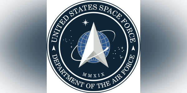

President Donald Trump tweeted out the logo for the brand-new U.S. Space Force on Friday, presenting it as a collaboration between “Great Military Leaders, designers and others.”
Thing is, fans of Star Trek will find that the logo looks strikingly familiar. In fact, it looks almost exactly like the emblem of Starfleet, the uniformed space force maintained by the United Federation of Planets.

SpaceFleet command logo (Wikipedia)
Just compare the two side-by-side, the similarities are astronomical. There’s the arrow-shaped center device, the swishy space sperm doing a lap around the arrow shape, the diversely-shaped array of stars on the field surrounding it, and the official name circumnavigating it all.
One unique touch on the U.S. Space Force logo is the number “2019” written in Latin numerals at the bottom, 2019 being the year the Space Force was signed into law.
“The creation of the U.S. Space Force seal pays tribute to the newest Armed Service that organizes, trains, and equips space forces in order to protect U.S. and allied interests in space and to provide space capabilities to the joint force. The U.S. Space Force seal honors the Department of the Air Force’s proud history and long-standing record of providing the best space capabilities in the world,” Maj. William Russell, U.S. Space Force spokesperson, said in a statement to Task & Purpose.
“The delta symbol, the central design element in the seal, was first used as early as 1942 by the U.S. Army Air Forces; and was used in early Air Force space organization emblems dating back to 1961. Since then, the delta symbol has been a prominent feature in military space community emblems.”
Between the Army uniforms that Space Force is wearing, and now the logo ripped straight out of Star Trek, when is Space Force going to develop its own identity? Because we have a top candidate for brand advisor.
